
UI/UX • MOBILE & WEB DESIGN
This project was the redesign of the Slice app, version 5.0. Slice is an app that helps keep track of all your online shopping, from tracking shipments, orders, any price drops for items you’ve recently purchased, and more. Slice really helps you do it all.

The problem
The existing app needed a refresh. It looked dated and lacked some of the necessary information users seek, visual imagery and delightfulness. From user feedbacks gathered, users wanted to see more information right away about their shipments and orders and take actions on them if necessary.
My role
The team working on this app consisted of 4 designers (myself, a UX principle, a visual designer and a UI/UX designer), 2 product managers, a growth hacker and 3 mobile engineers. A lot of the initial user research and flows had already been done when I joined the team. But there was still a lot left to be decided and done such as the logo redesign, fonts and colors and any visual styles and interactions within the app. Some of my contributions to this redesign was helping the team decide on which logo, fonts and colors to go with, taking the app home screen and spending overview sections to the finish line, working on the entire onboarding flow and designs to get users signed up quickly and into the app and any touch-ups wherever needed.

Above: This was the progress of the home screen redesign when I took over. For the most part, the visual part was there, having card-like displays of active shipments, showing users images of items they’ve purchased and a map of where that shipment is in transit.
I jumped right in and got to work with whatever was needed, in this case the design of the app home screen. The main goal for the home screen redesign was to help users locate their stuff easily and as quickly as possible. To know when they’re expecting a package, find where their most recent or not so recent order is, be alerted of any price drops or product recalls and to provide quick access to frequently needed management tasks; like marking shipments as delivered, deleting cancelled orders or pinning an order to the top so you can keep an eye on it. Also, other goals for this home screen redesign was to look for ways to prevent the blank screen look when there aren’t any active shipments as the last home screen looked and to keep it visual, more like a comic book than a novel and make all of this work on both phones and tablets.

Above: Continuing with what was already there, I refined the card visuals. Instead of having a bold bar at the top indicating statuses of shipments, orders or items, I opted for icons with color indicators and added in interactions such as swiping from left to right on shipment cards to bring in the map view or for all the cards the 3 dots curved icon to show quick action items so users can quickly mark a shipment as delivered, add tracking, pin to top or delete. Also, users can choose to collapse the card-like view if they prefer a less visual view of their home screen by pinching. They can zoom to expand back to card view. On empty states, we took advantage of the real estate to educate users with tips, have call-to-action cards to add a shipment or order or email customer support with any issues. These designs were initially designed on iOS first, then once all looks good, I transferred them to Android.
Below: In the end, this was the final design for the home screen, for both iOS and Android, both phones and tablets.

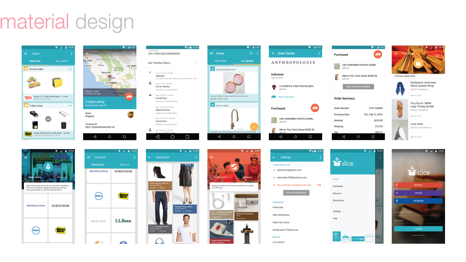
Shortly after we released the new app redesign for Slice, Google announced the release of Material Design. We knew we wanted to get on it right away, to be one of the first ones to adopt and use this new design pattern in our app. I took full ownership of this Material Design redesign, for both phone and tablet. I went through the Material Design guideline, making sure every dp was spot on, taking full advantage of the various planes, images, colors and interaction libraries. For the tablet designs, we made use of the larger screen size to show users more information so that it’d they them less touches to get to what they’re looking for. In the end, after some back and forth with feedbacks from various stakeholders and our Google contact, our app with the new Material Design was released into Google Play. Upon release we discovered the newly designed Slice app was featured as Editors Choice.
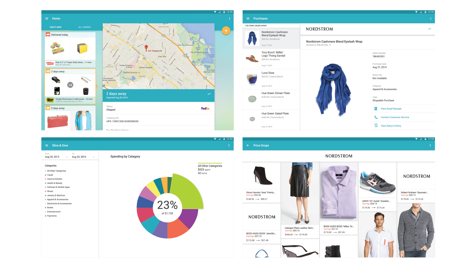
Redesigning the app in Material Design gave me and Slice an opportunity to design for tablet. The tablet designs paved the way for the logged-in website redesign (below).

Having designed the Android tablet, it made sense that our web app should look similar, taking advantage of the Material Design style and patterns. I revamped all the logged-in pages of the Slice website, making it consistent with the mobile app. This way when users log onto our website, they get a similar experience to what they find in the app.
5.0 Results
- Featured as Best New Apps by Apple, Editors Choice by Google
- Downloads on iOS jumped 260% post 5.0 redesign
- 100K users gained in the first year following feature by Google