02 — Case Study
← Work

A checkout redesign for online education enrollment.
The problem
Users were abandoning checkout because Emeritus wasn’t a household name, and the flow gave them no real reason to trust it. The brand recognition gap meant that even users who’d made it all the way to the payment page were dropping off at the last moment — which made for a really interesting problem to dig into.
The decision
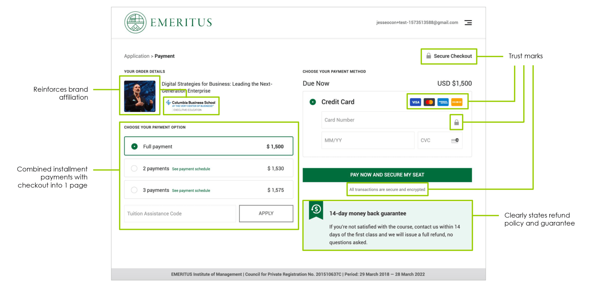
I had the opportunity to treat trust as the design problem, not the form itself. The standard playbook for low-converting checkouts is to shorten the form and optimize fields — and I did that too — but it wasn’t the real lever. The deeper work was making the page itself reassure the user: surfacing the university brand affiliation at the payment moment, rewriting the refund policy in plain language above the CTA, and stripping out every non-checkout element on the page so nothing competed with the decision to enroll.
The work
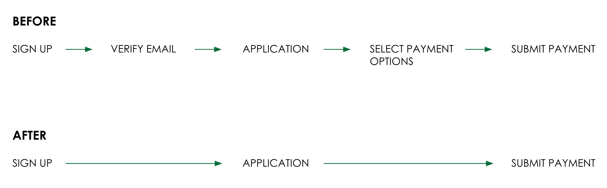
Flow: To help move users along in their checkout journey, a couple of steps were removed in the new design/flow.
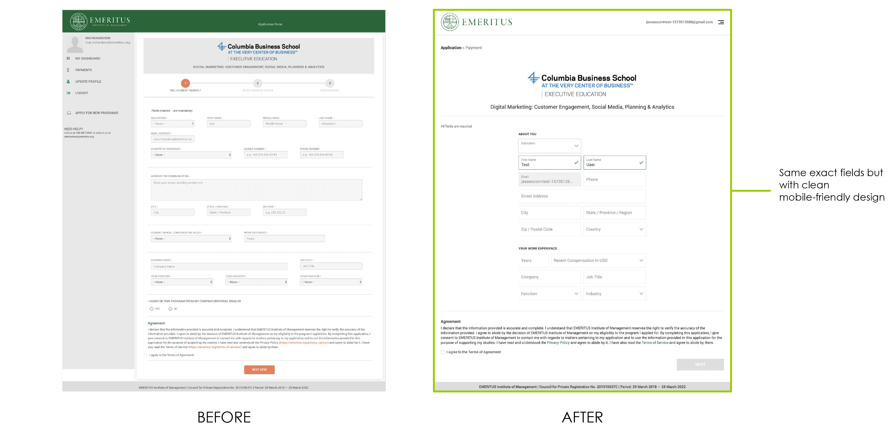
Application: Preserved all fields while redesigning the form for a clean, mobile-friendly experience.
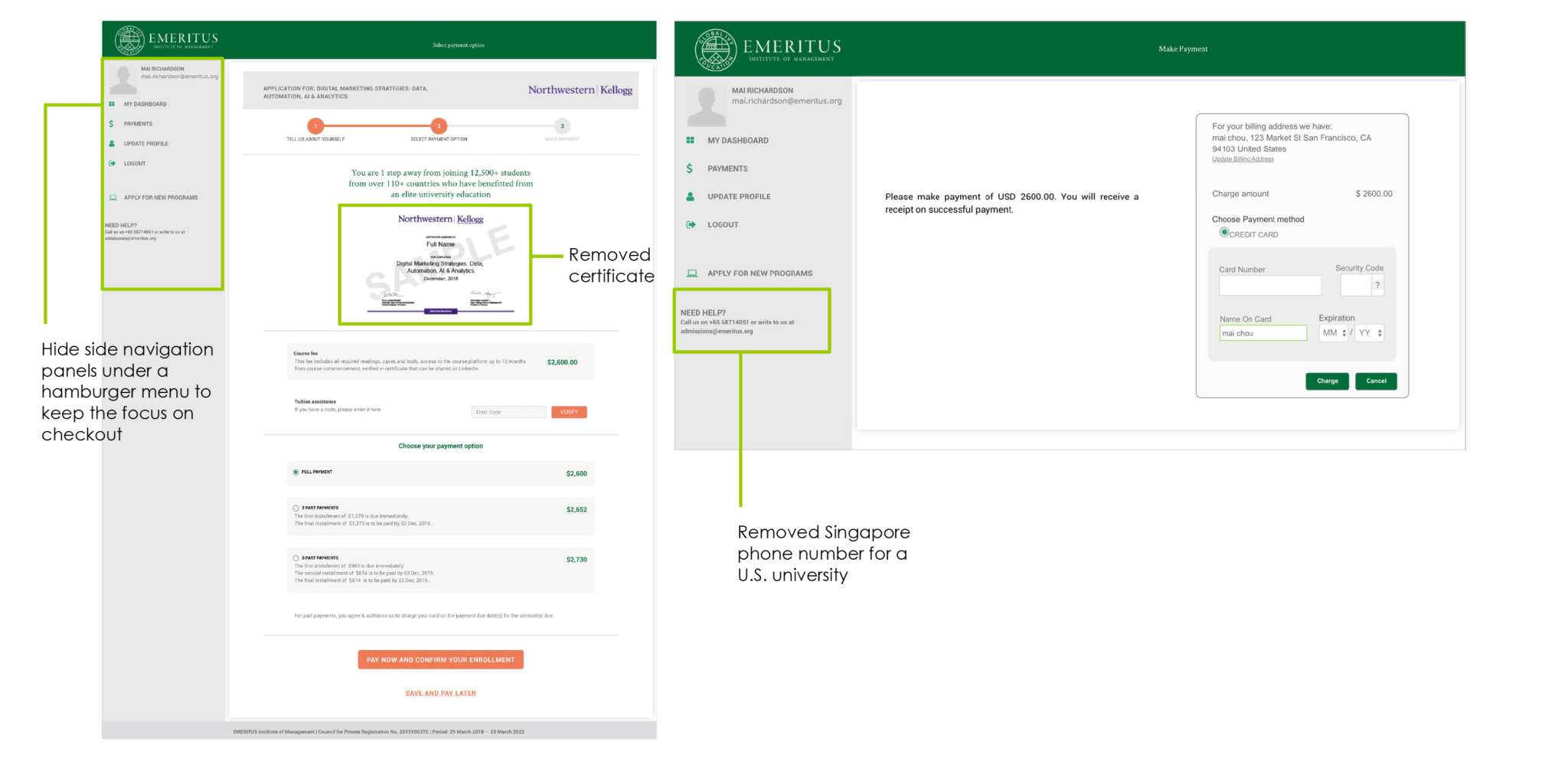
Checkout: Streamlined the UI by removing nonessential sections to keep focus on checkout, while adding university brand affiliation, trust signals, and clear refund policy messaging.
Before
After
What I intentionally removed
- Email verification step — a hard stop between intent and action that the data later showed was costing us 57% of page views.
- Cross-sell and “explore other programs” sections — a user on the checkout page has already decided, and offering alternatives only re-opens a closed decision.
- Three of five layout variants — set aside in favor of testing the two that most directly contrasted density versus reassurance, so the A/B result would tell us which lever actually mattered.
The outcome
- 18.1% conversion uplift over control, against a 4.75% target.
- Statistical significance reached in four weeks.
- Removing the email verification step drove 57% more application views — physical friction, eliminated.
- Trust and clarity changes drove 49% more submits and 18% more payments — cognitive friction, addressed.
- Reframed how the team prioritized future tests: trust gaps over form length.