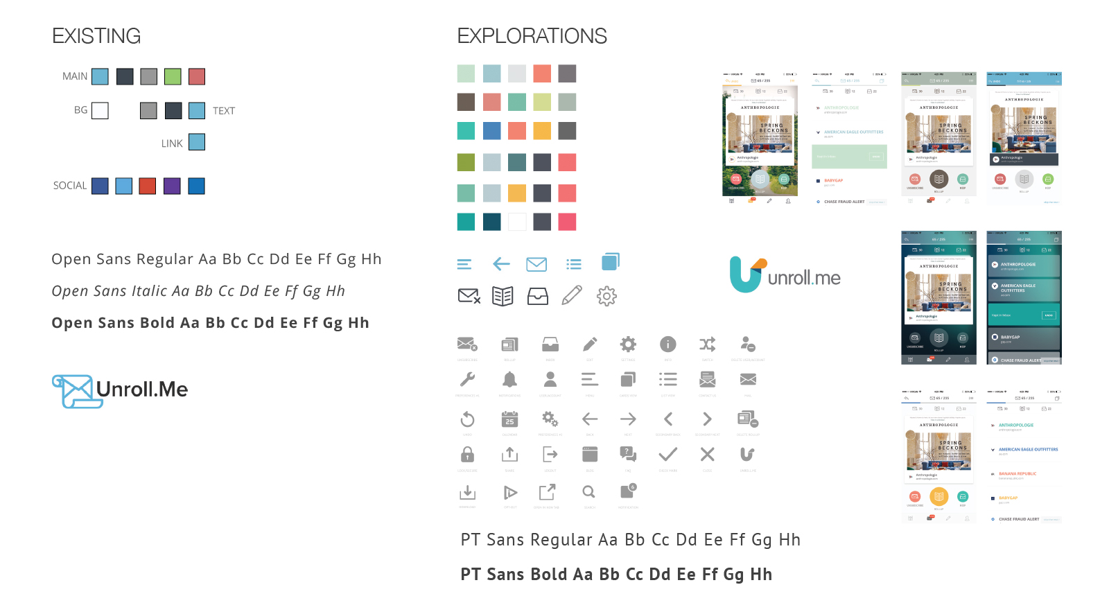
03 — Case Study
← Work
The first mobile app for an inbox management product.
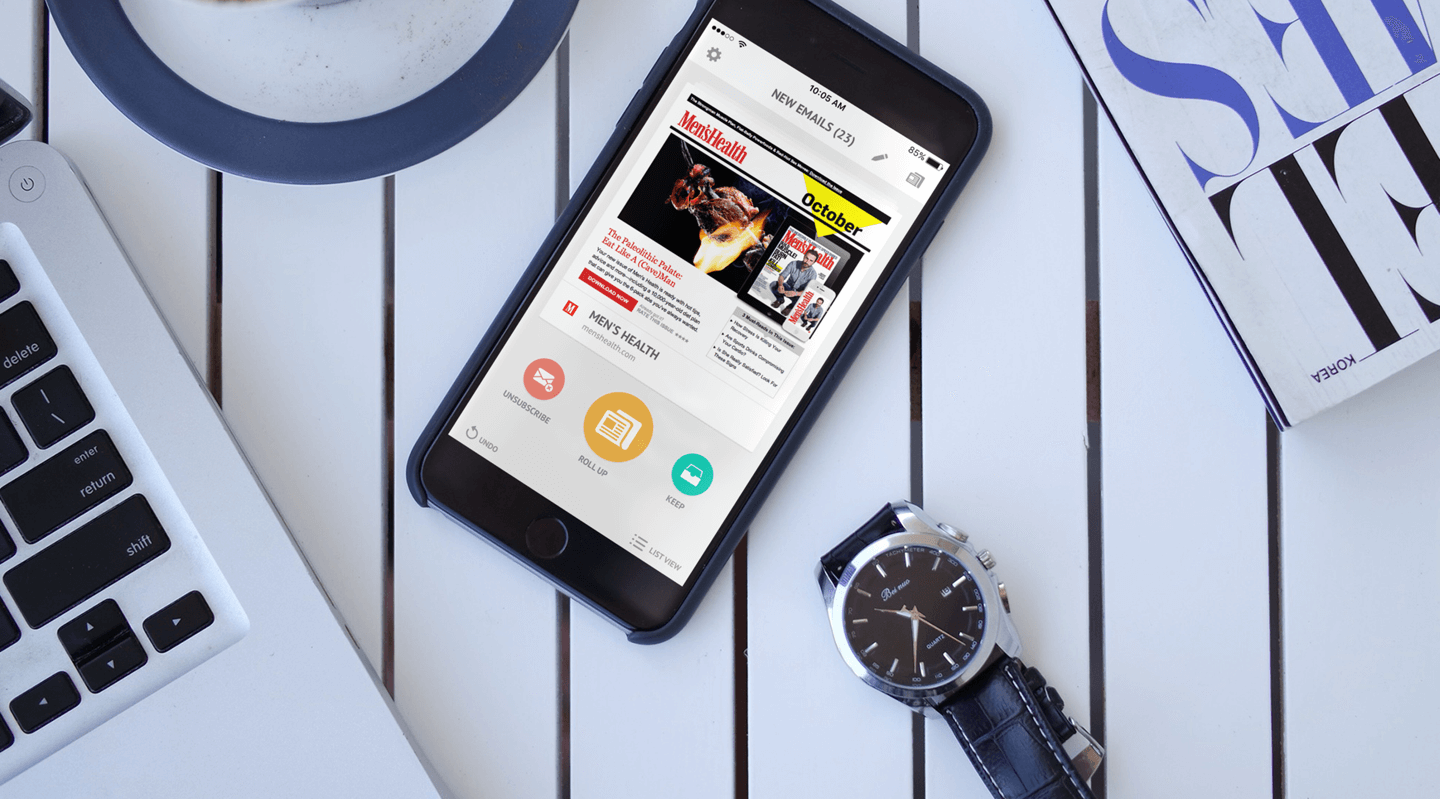
The problem
Users wanted to manage their email subscriptions on their phones, but the web product was built around a table-based UI that didn’t have a natural translation to mobile. Rather than shrinking the existing experience down, we had the opportunity to rethink what the product wanted to be on a smaller screen — which made for a really interesting design challenge.
The decision
I had the pleasure of designing the mobile app as a category translation rather than a port. The core interaction became a swipe deck — left to unsubscribe, right to keep, up to roll up — borrowing a pattern users already understood and applying it to the less familiar task of subscription triage. The onboarding then did double duty: instead of hiding the technically-required inbox scan behind a loading screen, I used that wait as a tutorial surface, teaching the swipe gestures on sample cards while the real scan ran in the background.
What I intentionally removed
- Traditional list view as the primary interface — the list pattern was what made the web product feel like a chore, and the mobile product needed to feel like a different kind of activity.
- Loading screen during inbox scanning — every second spent waiting is a second where a first-time user might close the app, and the scan time was really a teaching opportunity disguised as a constraint.
- “Skip tutorial” option — the tutorial was the product; skipping it meant landing in a swipe deck with no idea what the swipes did, and making it short enough to fuse with the scan wait was the better answer.
The work
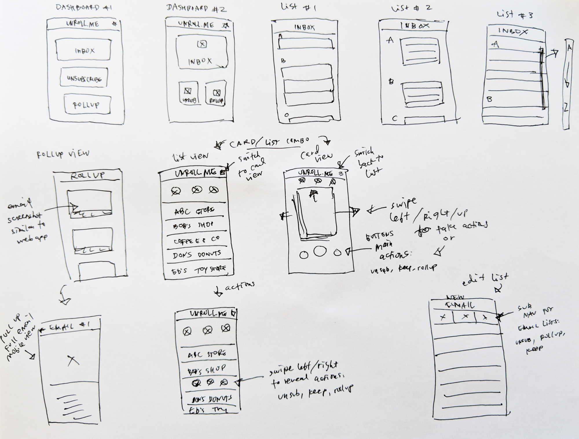
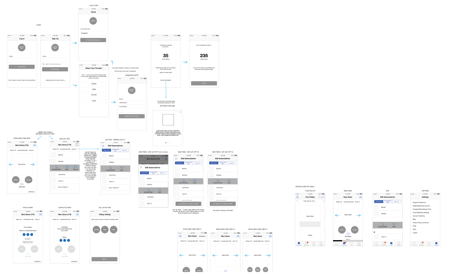
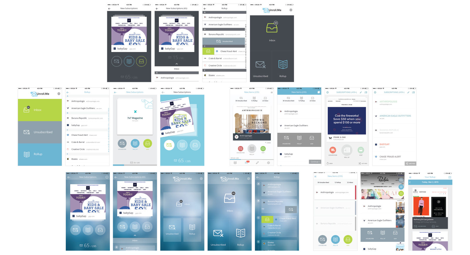
Explorations
Early sketches and wireframe iterations exploring different layouts, navigation patterns, and interaction models before landing on the swipe deck approach.
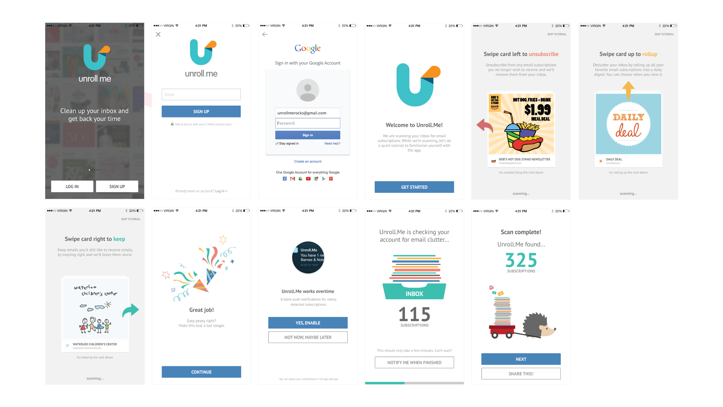
Onboarding
Designed an interactive tutorial that teaches the card-based editing actions (unsubscribe, roll up, keep) while inbox scanning runs in the background. This keeps users engaged, reduces perceived wait time, and ideally transitions them straight into managing subscriptions, with push or email notifications available if scanning takes longer. See UserOnboard.com’s review of this onboarding design.
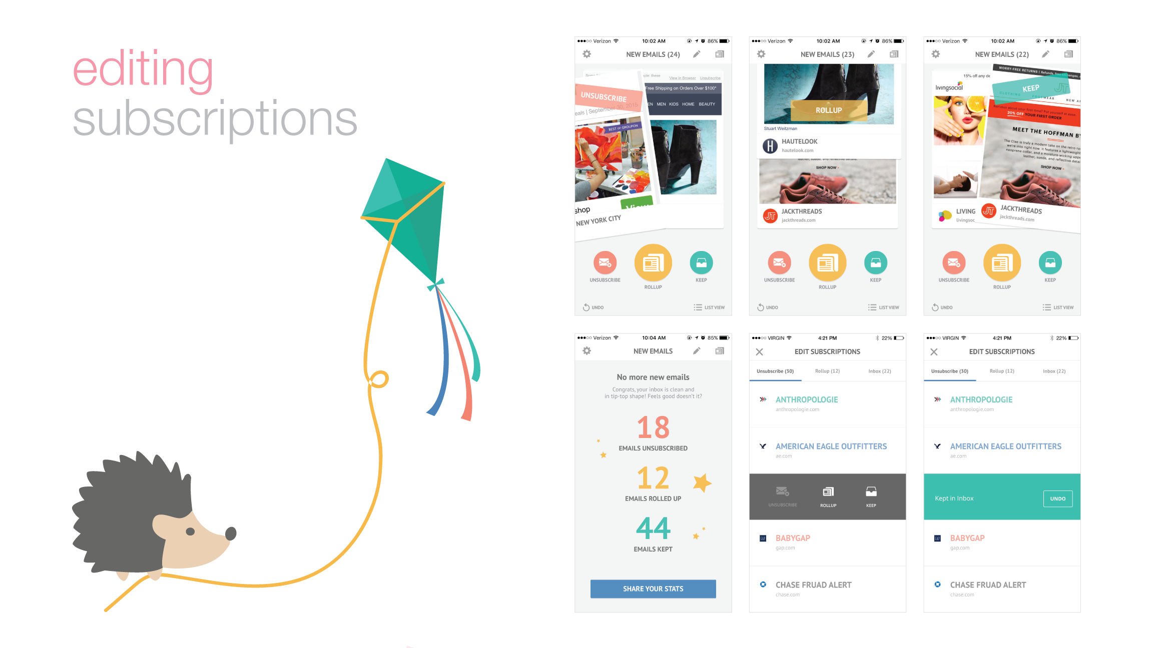
Editing Subscriptions
Introduced a Tinder-style, swipe-based card interface for fast mobile editing — swipe left to unsubscribe, right to keep, or up to add to the Rollup. Users can switch between card and list views, edit past actions, and choose the workflow they prefer. Multiple iterations led to a flexible system that makes cleaning up the inbox fast and intuitive.
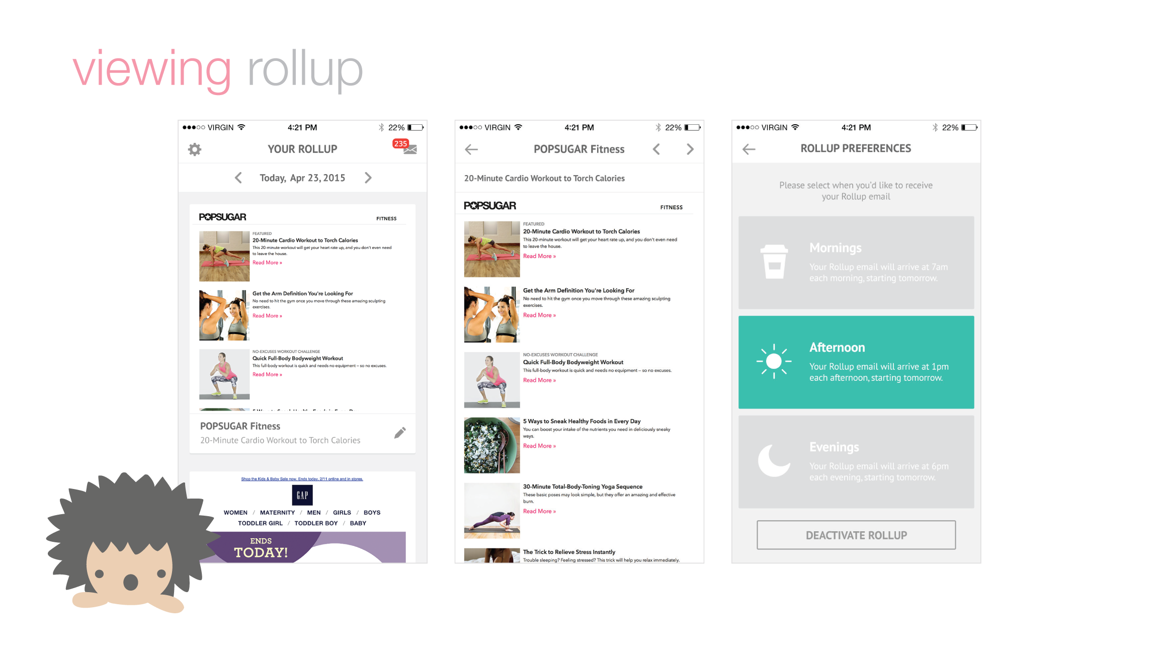
The Rollup
The Rollup is a once-daily digest of selected subscriptions, delivered at your chosen time — morning, afternoon, or evening. Rollup emails skip your inbox and are bundled into a single email, which users can browse and take action on directly in-app, with all links and attachments fully functional.
See the App Video
The outcome
- 527,000 signups in the first three months.
- Featured by Apple as Best New Apps and Best in Productivity.
- #1 in Productivity, #7 overall in the App Store.
- 2M iOS downloads.