
Emeritus is committed to teaching the skills of the future by making high-quality education accessible and affordable to individuals, companies, and governments around the world. It does this by collaborating with more than 50 top-tier universities across the United States, Europe, Latin America, Southeast Asia, India, and China. Emeritus’ short courses, degree programs, professional certificates, and senior executive programs help individuals learn new skills and transform their lives, companies, and organizations. Its unique model of state-of-the-art technology, curriculum innovation, and hands-on instruction from senior faculty, mentors, and coaches has educated more than 250,000 individuals across 80 countries.
Problem + Hypothesis
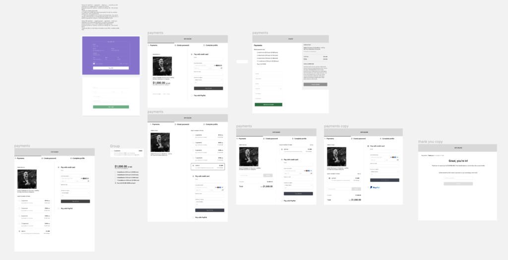
Emeritus is not a recognizable brand name and does not have a standard payments UI or message its refund policy during the checkout flow. The goal is to improve the messaging and overall UI of the current application and payment flow and run an A/B test with the goal of a 4.75% funnel CVR increase.
Design Explorations
During this phase, an audit of various websites was taken to see how their checkout experience was like and if there were any patterns amongst them. What we discovered was that many sites had clear trust marks ensuring the transaction was safe and secure along with refund messaging. Some sites broke up their flow into smaller chunks (progressive-like) while others had fewer steps and showed the item a user is about to purchase. These things were taken into account for the redesign.


Designs (Before & After)
Flow: To help move users along in their checkout journey, a couple of steps were removed in the new design/flow.

Application: All the fields were kept but the form was updated to give it a clean, mobile-friendly design.

Checkout: Similar to the application page, the UI was updated and various sections removed to maintain the clean, clutter-free look, and keep the focus on the checkout. New elements were added to reinforce brand affiliation (with universities), add trusts, and clear refund policy.


Outcome
The A/B test ran on a small set of our program offerings and after 4 weeks reached statistical significance. The result was an 18.1% uplift between control and variant. Some learnings from the experiment:
- Physical friction
- 57% more application page views (removing the email verification step)
- Cognitive friction
- 49% more application submits
- 18% more payments